Discourse has begun pushing a new sidebar layout, titling the old layout as “legacy”. While I don’t know it for certain, I’m assuming that they’ll phase out the legacy layout overtime. Due to this, I decided to look around to see what the current theme landscape looked like, and stumbled across this one: Pinboard, a simple UI theme - theme - Discourse Meta
I ran it by a few people, and then got to work going over the finer details with @Will. The stock theme makes a lot of elements very large, and the sharper elements within Discourse contrasted very harshly with some of the theme’s softer/rounded elements. I’ve spent the last hour or two going over these details, shrinking some of the stock elements, and smoothening some of the sharper default elements.
Your feedback is very welcome! The consensus among the people I’ve asked has been very positive, but I’m sure some of you will dislike certain changes. If you do dislike something, please be as specific as possible as I’d love to make this theme work!
You may have noticed that the multiple theme options have gone away; this is because we’re now making use of Discourse’s new(-ish) dark mode support. With this, we can now have a single theme with multiple colour presets, which can be used to toggle between light/dark mode. We’ve added a convenient toggle to the header bar, though this seems to function a little strangely if you’re logged in. You can of course go into your user preferences and set it here instead
Not a big fan of “simplifying” things by adding huge empty spaces and big buttons. I am not sure if by sidebar you mean the sidebar on the left (that one I never use, perhaps it could be disabled entirely if it doesn’t fit the old layout?) or the dropdown when clicking on my profile. If it’s the dropdown, then well… I don’t like that one either. At first it’s confusing as there is no text next to the icon and it add unnecessary complexity to the notification system.
I can see such design for single purpose machines i.e. McDonald’s kiosks, but not on my PC.
Edit: The “toggle color scheme” next to profile doesn’t seem to work for me
Edit2: The link in your post (user preferences) links to your profile
Appreciate your feedback I disagree that anything is being simplified, if anything this layout gives more information by default compared to the previous layout. The butten sizes I believe are very close to what they were before, but they are slightly larger and I agree that they should be reduced. Additionally, there isn’t really any empty space. At best, there’s some padding between the header and the all categories line, and a very minimal amount of padding added between that and the thread list.
By sidebar, I’m referring to the bar on the left. As explained in the opener, Discourse is pushing to make this the default for new installations, and have switched the header-based version (the dropdown) to being the “legacy” layout. I do agree that the user dropdown/sidebar part is worse funcitonality-wise, unfortunately this has nothing to do with any changes I’ve made and was just a part of an older Discourse update.
As I said in the opener, the toggle seems a little weird right now. It works for guest users, but seems temperamental if you’re logged in.
Edit: oops, missed that it linked to my own profile! Thanks, I’ve just fixed that
If you keep the left sidebar open, the new layout looks decent. But the moment you close it, the different background and main-content colors just scream “look at me, I am wasted space”. Even if the old layout still had lots of padding on the left and right, it never bothered me as it was the same color.
Perhaps it is a good starting point. I tried to quickly do that using dev tools, though it’s a pain without the original CSS file. It would require some more adjustment than just the colors. The main-container seems to have some borders making it appear floating, rather than flush with the background.
Also, didn’t the original theme have a slightly darker background?
We’re using the exact same colour profile in Discourse as we were before, but there’s a good chance that the theme adjusts the brightness of certain colours to fit certain uses. I’ll have a play around with it a bit
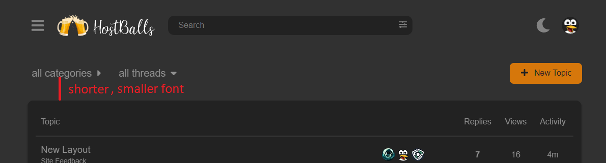
I’ve reduced the size of all buttons, as well as the padding around the main container
There’s only one theme now, so we’re all using the same The only thing that can be changed now is whether it’s light or dark. If you’re on mobile, you won’t see much of a difference
As I mentioned in the opener, could you maybe be a little more specific? I’ve already reduced a bunch of the unnecessary padding and large sized elements (if you look at the demo of the Pinboard theme here, you’ll see the difference). Aside from the breadcrumbs, I don’t see much more than can be done. So if you could be a little more specific, I’d really appreciate it!